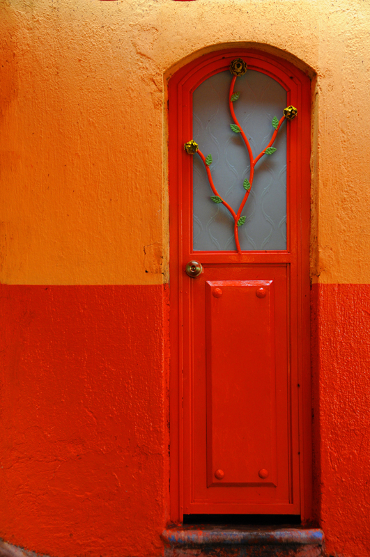
Spring is upon us, and with it the holiday celebrating new life.
Whether your inclinations tend
toward the formal pageantry of church,
or a more casual appreciation of the holiday's trappings,
for this grand occasion,
Paint it Easter EGG!
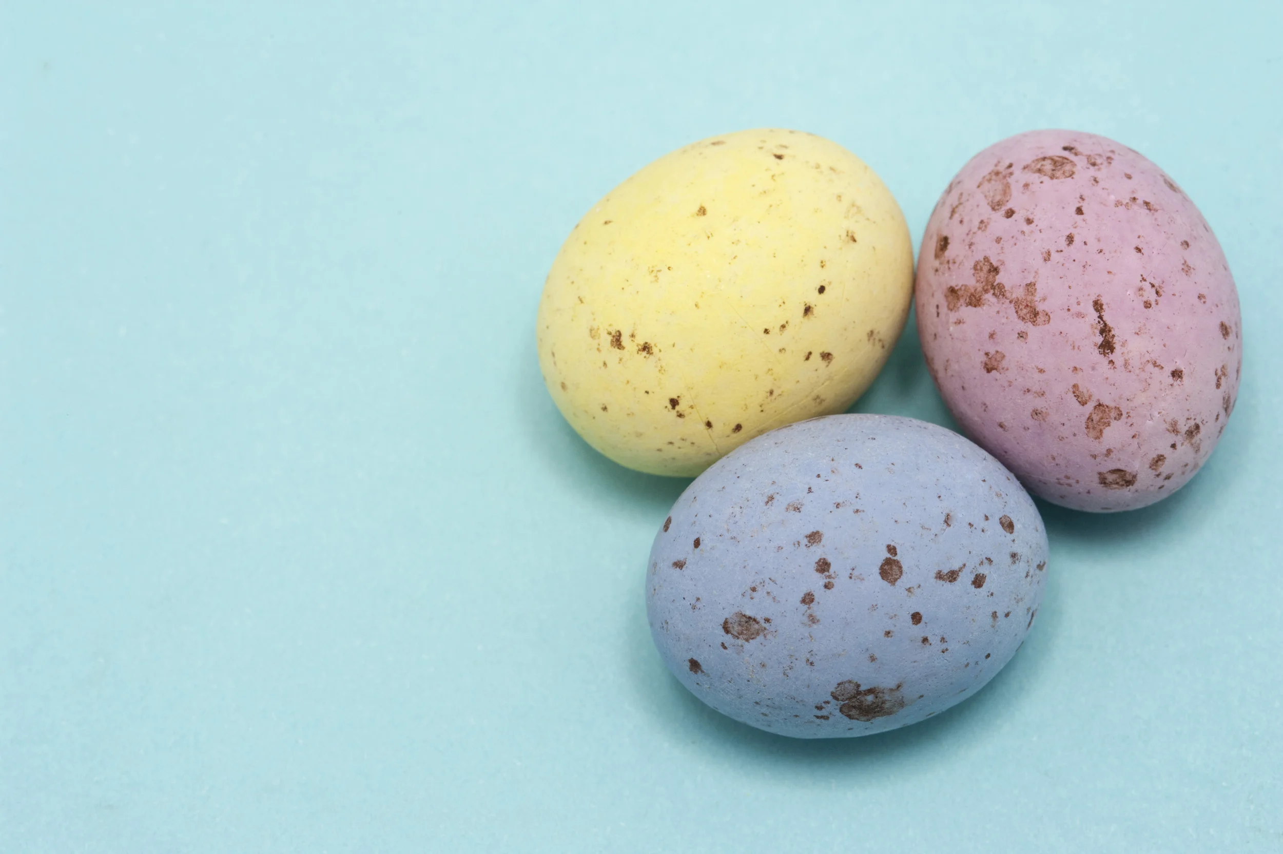
The cast of characters in our festive pastel parade:
Lavender
Orchid
Pink
Periwinkle
Baby Blue
Yellow
Mint
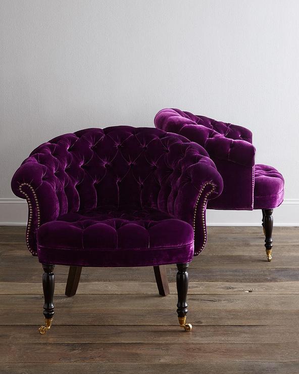
• • • Lavender • • •
What could be more inviting
than a plump lavender velvet chair
perfectly oversized for snuggling up
with the one you love?
Comfort…perfected.

photo courtesy of vivid-interiors.com
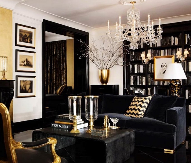
Tufted lavender velvet makes this
crisp crystalline living room approachable
in a friendly yet very sophisticated way.
For those who fear pastels as child's play,
lavender never looked more classy.

photo courtesy of cozycomfycouture.com
• • • Orchid • • •
That lovely balance point between pink and lavender.
Velvet again, paired with bold wallpaper.
Funny, isn't it, to think of pastel anything as bold
— but here you go!
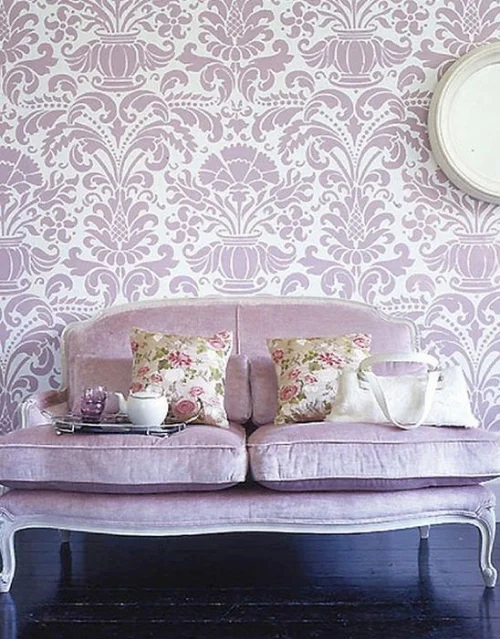
photo courtesy of lauracaseyinteriors.com
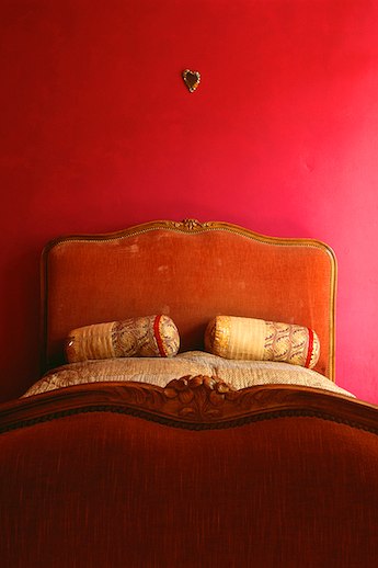
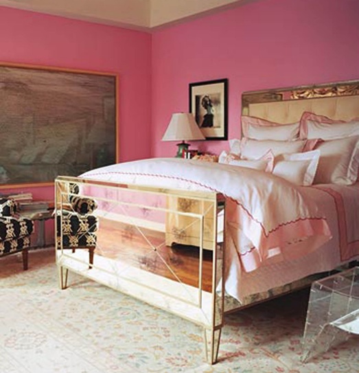
• • • Pink • • •
Serenity is the earmark of this lovely pink retreat.
Soft, mellifluous, and glamorous.
who couldn't relax on this chaise?

photo courtesy of thepeakoftrechic.com
The elegance of pink in a color-wash ombré wall
— from cream at the top fading down to petal pink at the base —
this is how I like my simplicity:
colorful & mindful,
with lots of room for my mind to roam.

photo courtesy of homedesignboard.com
• • • Periwinkle • • •
If any color speaks the language of Easter,
in my book periwinkle does.
Paired with bright white,
it rates at the top of my color love scale.

photo courtesy of countryliving.com
• • • Baby Blue • • •
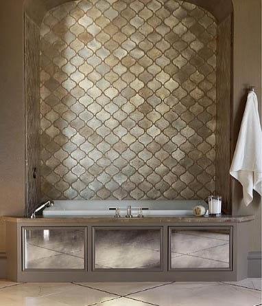
Baby blue pairs with white in this airiest of bathroom spas.
Heavenly!

photo courtesy of carlaaston.com
• • • Yellow • • •
Butter yellow and baby blue
team up in a farmhouse setting
that feels both traditional
and fresh at the same time.
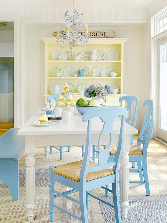
photo courtesy of mixandchic.com
• • • Mint • • •
This quintessentially girly bureau is
a fairly conventional execution of mint.
The lacy white accessories, however,
float like doilies reinvented in metal......

photo courtesy of migonishome.com
If that bureau represents mint in a conventional sense,
this chevron flooring moves mint in a totally unexpected direction.

photo courtesy of calloohcallay.ca
• • • Easter Basket • • •
Here — our pastel cast of characters
are rounded up into a dining room
as charming as mint chip ice cream.

photo courtesy of vtwonen.ne
It is the perfect way to sign off with warmest wishes for your
Easter celebration and the new life it ushers in.
For more color inspiration, check out our Pinterest Board!
Love what you see? Sign up to receive our Spectacular Design inspirations!
*header photo courtesy of freeimages.co.uk